skip to main
|
skip to sidebar
Monday, October 26, 2009
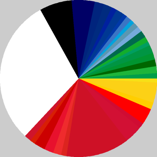
I sure do like this. It's a pie-chart, if you didn't know. And what it illustrates, is the proportion of colours used in world flags.
Nice work.
No comments:
Post a Comment
Newer Post
Older Post
Home
Subscribe to:
Post Comments (Atom)
Do you think that physician-assisted euthanasia should be legalized?
What a cunt
Send nudes to:
allhailthefc@gmail.com
Better sites than this one
Is Anyone Up?
Decapitate Animals
Yimmy Yayo
The Daily What
Fuck Cunts Mixtape Vol. 1
Fuck Cunts Mixtape Vol. 2
Disciples
Old shit
►
2012
(312)
►
May
(1)
►
April
(60)
►
March
(89)
►
February
(94)
►
January
(68)
►
2011
(1112)
►
December
(52)
►
November
(87)
►
October
(95)
►
September
(102)
►
August
(93)
►
July
(135)
►
June
(88)
►
May
(79)
►
April
(90)
►
March
(104)
►
February
(87)
►
January
(100)
►
2010
(2473)
►
December
(115)
►
November
(181)
►
October
(144)
►
September
(208)
►
August
(144)
►
July
(189)
►
June
(259)
►
May
(347)
►
April
(273)
►
March
(236)
►
February
(247)
►
January
(130)
▼
2009
(679)
►
December
(195)
►
November
(151)
▼
October
(126)
No title
Ya know how sometimes breaking up with a girl can ...
No title
okimback...
Woah...
I'm sick...
This is so awesome. I love how, 'oh-fuck-oh-fuck-o...
No title
I didn't know you could light penis-farts?
No title
No title
No title
No title
Eating pinapples...
No title
No title
No title
I had a shoe full of Baileys and I'm drunk as a bi...
No title
No title
No title
No title
No title
No title
No title
No title
No title
Earlier this year...
I love Bats. And laughing. And I think the clip of...
I sure do like this. It's a pie-chart, if you didn...
Chaz haz blog.
Bacon scarf. I need this.
This image won Jose Luis Rodriguez the Wildlife Ph...
Oh man...
No title
I think if you stay, something bad will happen. I ...
No title
If this doesn't...
Most pointless, yet awesome hobby of all time.
No title
If this doesn't convince you that soccer players a...
No title
No title
No title
No title
No title
This guy could have sex with you if he wanted to, ...
Well-played.I hope Falcon's parents die of cancer ...
Some months ago...
No title
No title
Joshua Hoffine...
No title
No title
No title
No title
No title
No title
No title
Just when I thought...
No title
Oh man, Falcon the balloon-boy has prompted a shit...
Just in case you need...
Forget...
No title
Honestly...
No title
I really want to know how this happened. Cat learn...
No title
No title
YEMEN!
Will it Blend?
No title
No title
And I thought I was a cunt!
No title
No title
Ha ha ha ha ha ha ha! Ha ha ha ha! HA HA HA HA!If ...
What the fuck!? An owl with tits? How was this eve...
No title
This image was awesome when I though it was about ...
No title
No title
No title
You would have to be slightly ill to do this.
No title
No title
This is such a good idea! Pity that the pope is a ...
No title
Holy shit, so THAT'S what ninjas look like when th...
I'll cry if I want to...
Fuck this is awesome. G.G. Allin had many beliefs ...
No title
No title
No title
No title
No title
No title
Ha ha ha...
No title
No title
No title
Well tickle me pink...
No title
Gavin?
No title
No title
No title
No title
I'd like to show you...
No title
No title
No title
The best thing about living in Melbourne is...
In 1896 Russia...
In Nazi-occupied Russia...
No title
No title
Another day...
No title
I posted a gif of this awhile back...
Jesus H. Christ...
Put on a jacket while blade-scootering,
No title
No title
This duckling could teach us all a lesson.
►
September
(97)
►
August
(47)
►
July
(44)
►
June
(19)
I am a Dynamite
Ian Human
Melbourne, VIC, Australia
You make me sick.
View my complete profile
Are You In?
PIRATE


No comments:
Post a Comment