Monday, October 26, 2009
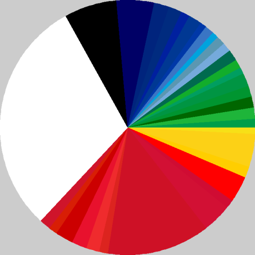
I sure do like this. It's a pie-chart, if you didn't know. And what it illustrates, is the proportion of colours used in world flags.
Nice work.
No comments:
Post a Comment
‹
›
Home
View web version

No comments:
Post a Comment